Shadows and rainfall in Urbino
A data visualization project around different flows crossing the central street "Via Aurelio Saffi" in Urbino.
Sun movement, rainfall subjected areas, peoples and cars flows have been carefully measured measured during the research period.
In order to correctly assess the water flow a scale model of the street was built.
Group project, realized during the course of “Instruments for data visualization”, held by professor Marco Ferrari, ISIA Urbino, A.A. 2012/2013.
Simone Ellero, Giammarco Gaudenzi, Riccardo Govoni, Giovanni Pignoni.
CZA
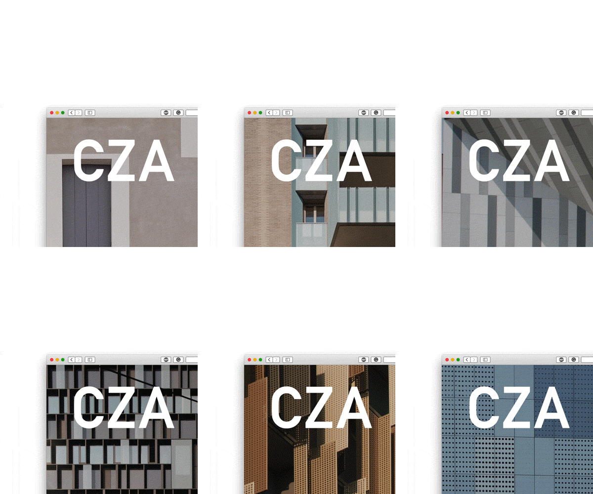

Corporate Website for CZA Cino Zucchi Architetti, a leading European architecture studio based in Milan.
This Corporate Website has a complex structure to serve both as portfolio and as archive for the studio. Secondary sections are also presents to include a news feed, press resales as well as the personal blog of the Chief architect Cino Zucchi.
This website has been developed and launched in 2017 during my work experience with studio Folder: Elisa Pasqual and Alessandro Busi created the graphical concept while I developed the responsive design and implemented the back-end (Wordpress) and front-end. The website is visible here.
The interface
Project developed during the collaboration with studio Folder.
Design and Development: Folder (Marco Ferrari, Elisa Pasqual, Alessandro Busi, Giovanni Pignoni)
Apio
Apio is a small start-up that designs, produces and sells DIY solutions for the Internet of Things. Thanks to the Apio broad a makers or a company is able to create smart object, remote controlled from a computer or smart-phone and interconnected to each other.
The mobile interface
The desktop interface
For Apio s.r.l. we developed the brand identity and the debut website, the prototype can bee seen here.
Group project, 2014/2015.
Giammarco Gaudenzi, Riccardo Govoni, Giovanni Pignoni.
VUD


Website and online shop for VUD, a wood workshop based in Trieste, Italy that has been producing cutting boards and tables since 2012. The initial brief was to create an online portfolio for the extensive list of products offered by the workshop. The website was not to be primarily a shop and more an online substitute for the physical act of visiting the workshop and learning about the workplace and its story.
The interface
This website has been developed and launched in 2019 in collaboration with Simone Ellero (design) and Davide Maria Palusa (photography).
My contribution has been the actual development of a custom Wordpress theme and the general responsive behaviour of the website. The website is visible here.
Nefti
The Nefti is an evolution of the typeface developed by Emma Magrini for her the exam of type design (professor Albert Pingherra, ISIA Urbino, A.A. 2013/2014).
This is an ongoing project, actively developed in conjunction by me and Emma.
If you are interested in this project, would like to use it as it is, continue the development yourself or even get us to finish it just for you, drop me a mail.
Initial drawings (by Emma)
cozy lummox gives smart squid who asks for job pen the lazy major was fixing cupids broken quiver sympathizing would fix quaker afta objectives a quick brown fox jumps over the lazy dog offagna quirky spud boys can jam after zapping five worthy polysixes the job of waxing linoleum frequently peeves chintzy kids sixty zips were quickly picked oflaga disco pax from the woven jute bag just poets wax boldly as kings and queens march over fuzz fiordo
cozy lummox gives smart squid who asks for job pen the lazy major was fixing cupids broken quiver sympathizing would fix quaker afta bjectives a quick brown fox jumps over the lazy dog offagna quirky spud boys can jam after zapping five worthy polysixes the job of waxing linoleum frequently peeves chintzy kids sixty zips were quickly picked oflaga disco pax from the woven jute bag just poets wax boldly as kings and queens march over fuzz fiordo
Leather cover #2
Yogurt Serif
The Yogurt serif typeface has been developed only for five days, during the 2014 Type Design Week. It has started as a modular stencil fonts and was later digitalized for completion. This is an ongoing project, still developed now and then.
If you are interested in this project, would like to use it as it is, continue the development yourself or even get me to finish it, drop me a mail.
Font developed during the 2014 Type Design Week w/ Fred Smeijers at ISIA Urbino.
Pgn Sans
The Pgn sans is the typeface I had to develop for the type design exam.
This is an ongoing project but the development is temporary on hold.
If you are interested in this project, would like to use it as it is, continue the development yourself or even get me to finish it just for you, drop me a mail.
cozy lummox gives smart squid who asks for job pen the lazy major was fixing cupids broken quiver sympathizing would fix quaker afta objectives a quick brown fox jumps over the lazy dog offagna quirky spud boys can jam after zapping five worthy polysixes the job of waxing linoleum frequently peeves chintzy kids sixty zips were quickly picked oflaga disco pax from the woven jute bag just poets wax boldly as kings and queens march over fuzz fiordo
cozy lummox gives smart squid who asks for job pen the lazy major was fixing cupids broken quiver sympathizing would fix quaker afta bjectives a quick brown fox jumps over the lazy dog offagna quirky spud boys can jam after zapping five worthy polysixes the job of waxing linoleum frequently peeves chintzy kids sixty zips were quickly picked oflaga disco pax from the woven jute bag just poets wax boldly as kings and queens march over fuzz fiordo
Font developed during the course of “Type design”, held by professor Albert Pingherra, ISIA Urbino, A.A. 2014/2015.
Simplification Center
During the second and third year as an ISIA student, I have been an active part of the entity we used to call “Simplification Center Isia”.
Lending library modules
A small group of students, coordinated by the director and professor Luciano Perondi in the effort of redesign and simplify the paperwork that keeps our university running.
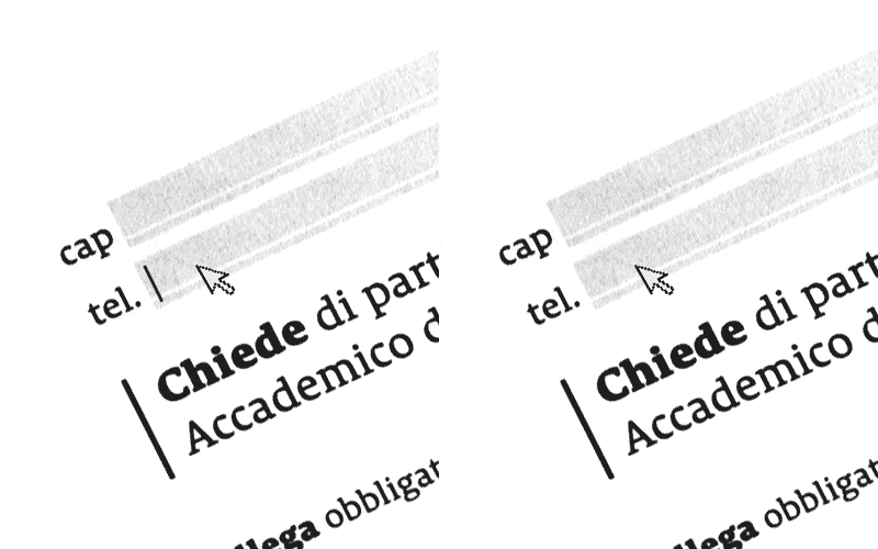
My major contributor has been developing easy to use pdf interactive forms. Fillable by hand or by computer, taking great care in measuring spaces in order to balance the two usage scenarios. In particular, I curated the multiple university enrollment forms, more than twenty, that are still in use today.
The appearance of the light gray fillable fields is so distinctive that it has become part of the institutional image of the University.
Extracurricular project, coordinated by professor Luciano Perondi, ISIA Urbino, A.A. 2014/2015.
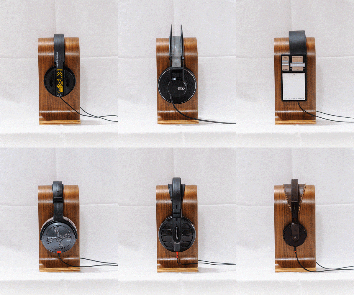
Headphones collection
Bang & Olufsen Form 2
Bang & Olufsen Form 1
Bang & Olufsen U70
AKG K135
AKG K241
AKG K301
AKG K340
AKG K500
AKG K501
Beyerdynamic DT150
Beyerdynamic DT220
Beyerdynamic DT880
Beyerdynamic DT990
Beyerdynamic DT831
Beyerdynamic DT931
Beyerdynamic DT880
Revox RH3100
Revox RH310
Sennheiser HD540
Sennheiser HD560
Sennheiser HD580
Yamaha YH2
Uncharted Website
The web page “uncharted.ooo" has been developed for Studio Folder to document the installation commissioned by the After Belonging Agency, curators of the Oslo Architecture Triennale 2016, as part of the "On Residence" exhibition at DOGA Norwegian Centre for Design and Architecture (September 8th – November 27th, 2016).
The mobile interface
My effort in the development in the physical installation is better documented here. More information on the project can be found directly on the official website.
This interface, part of the web page, has the purpose to give access trough a bi-dimensional device to the data representation we produced for the physical installation in Oslo: the amount of images token by Landsat satellites during the entire program from 1972 to 2016.
Project developed during the collaboration with studio Folder.
Research and design: Folder (Marco Ferrari, Elisa Pasqual, Alessandro Busi, Aaron Gillett, Pietro Leoni, Francesca Lucchitta, Giovanni Pignoni, Mariasilvia Poltronieri) / Design and production: Folder and Gisto (Alessandro Mason)
Uncharted Exibit
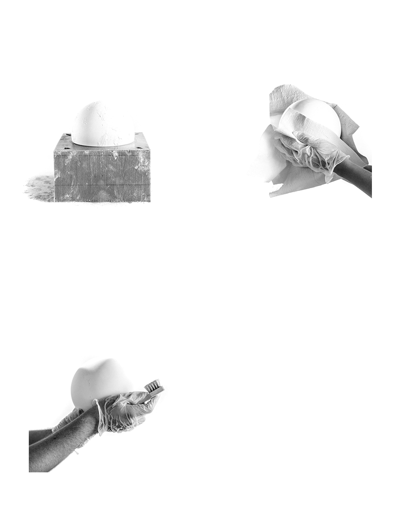
“Uncharted—Footnotes to the Atlas” is an interactive installation made of a series of experimental visualisations about the infrastructure of contemporary cartography. It has been first presented as part of the Oslo Architecture Triennale exhibition at DOGA Norwegian Centre for Design and Architecture (September 8th–November 27th, 2016).
The project aims to unearth the traces of the global remote sensing apparatus, its agenda and patterns of ownership, through the mapping of its objects, facilities, and data managed by different nation states and private corporations.
"On Residence" exhibition at DOGA Norwegian Centre for Design and Architecture.
The installation is composed of two main elements. The first one is a lightweight metal frame that supports a set of forty-five custom-made globes—a comparative cartographic tool for exploring the data coverage of the Landsat programme between 1972 and 2016. It shows the evolution and fragmentation of the global mosaic of satellite imagery, as an evidence of the biased interests (and the evolving capabilities) that determined the advance of remote sensing technologies over the past decades.
The second element is a table divided into three sections: a data visualisation about the Landsat spheres; a photographic catalogue of sample anomalies, fractures, and aberrations from satellite imagery of the Svalbard archipelago (home to one of the most important satellite ground station in the world); a set of three physical models that represent a vertical section cut through the sky of Google Maps, that shows how different image providers are covering the Earth’s surface from different altitudes and at different resolutions.
My major effort in the project has been reworking the meta-data extracted from the publicly available Landsat datasets. A geographical representation of the imagery’s distribution over time has been produced using python, tailoring the drawings around the capabilities of the drawing machine we wished to use for the final production.
The lines’ thickness, which represents the number of photos available for each year of activity, was originated by the increasing vibration of the robot’s arm, that hovers on the spinning globe while progressively drawing on it.
A set of forty-five globes were produced by mean of a silicon mould, the casted spheres were hand polished in order to obtain a smooth, matte surface.
Project developed during the collaboration with studio Folder.
Research and design: Folder (Marco Ferrari, Elisa Pasqual, Alessandro Busi, Aaron Gillett, Pietro Leoni, Francesca Lucchitta, Giovanni Pignoni, Mariasilvia Poltronieri) / Design and production: Folder and Gisto (Alessandro Mason)
Volvo 240
A small project to narrate the relationship between me and my dear old Volvo 240.
Project realized during the course of “Graphic design”, held by professor Marcello Signorile, ISIA Urbino, A.A. 2014/2015.
Washi Washi
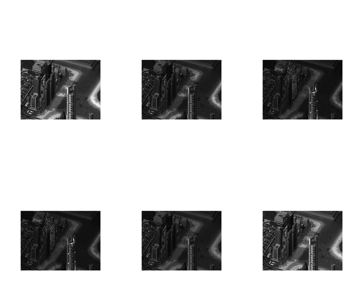
A Small side project conceived as a presentation of the thesis project, composed of two small booklets.
Volume I
The content of this project has been updated and integrated into my thesis and it's visible here.
Volume II
Project realized during the course of “Final synthesis”, held by professor Luca Pitoni, ISIA Urbino, A.A. 2014/2015.
REMC

'REMC' is a concept magazine about the information material aviable inside a cloistered monastery. The printed material was collected entirely at the local Monastery of St. Chiara in Urbino.
During the research the nouns where interviewed about their “media” habits, in order to better understand how informations can get in the monastery.
Surprisingly they manage to be actually very well informed, accessing information from some rather unusual sources, including a variety of missions around the globe (most based in Africa).
The general approach and overall quality of the magazines is questionable, still more varied than might be expected.
Project realized during the course of “Sociology of communication”, held by professor Matteo Guidi, ISIA Urbino, A.A. 2014/2015.
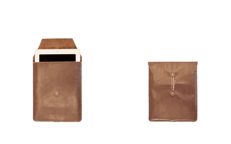
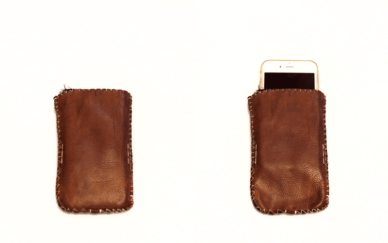
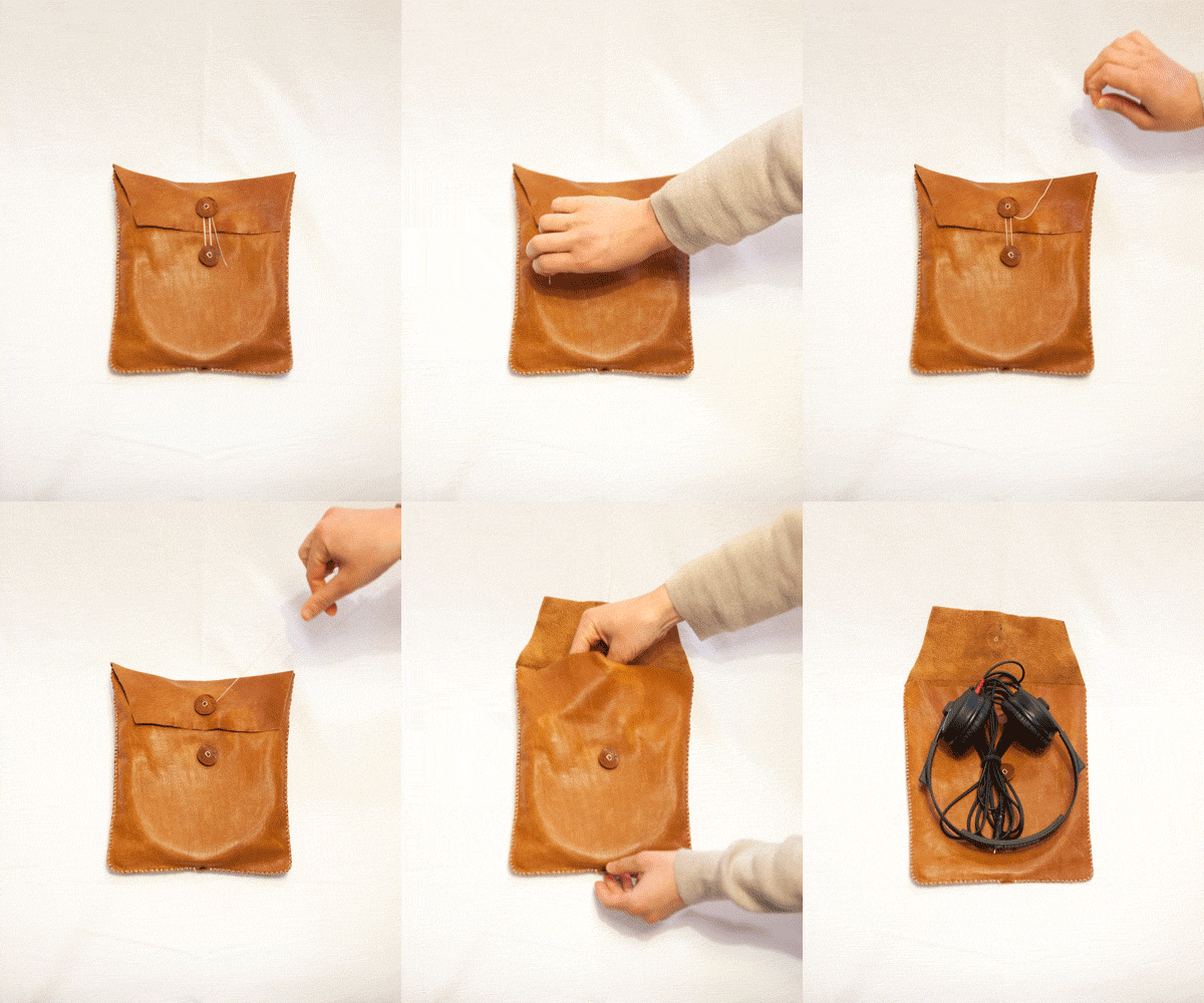
Headphone pouch
Camera
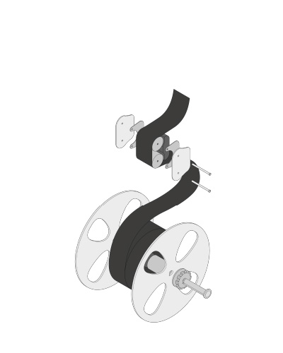
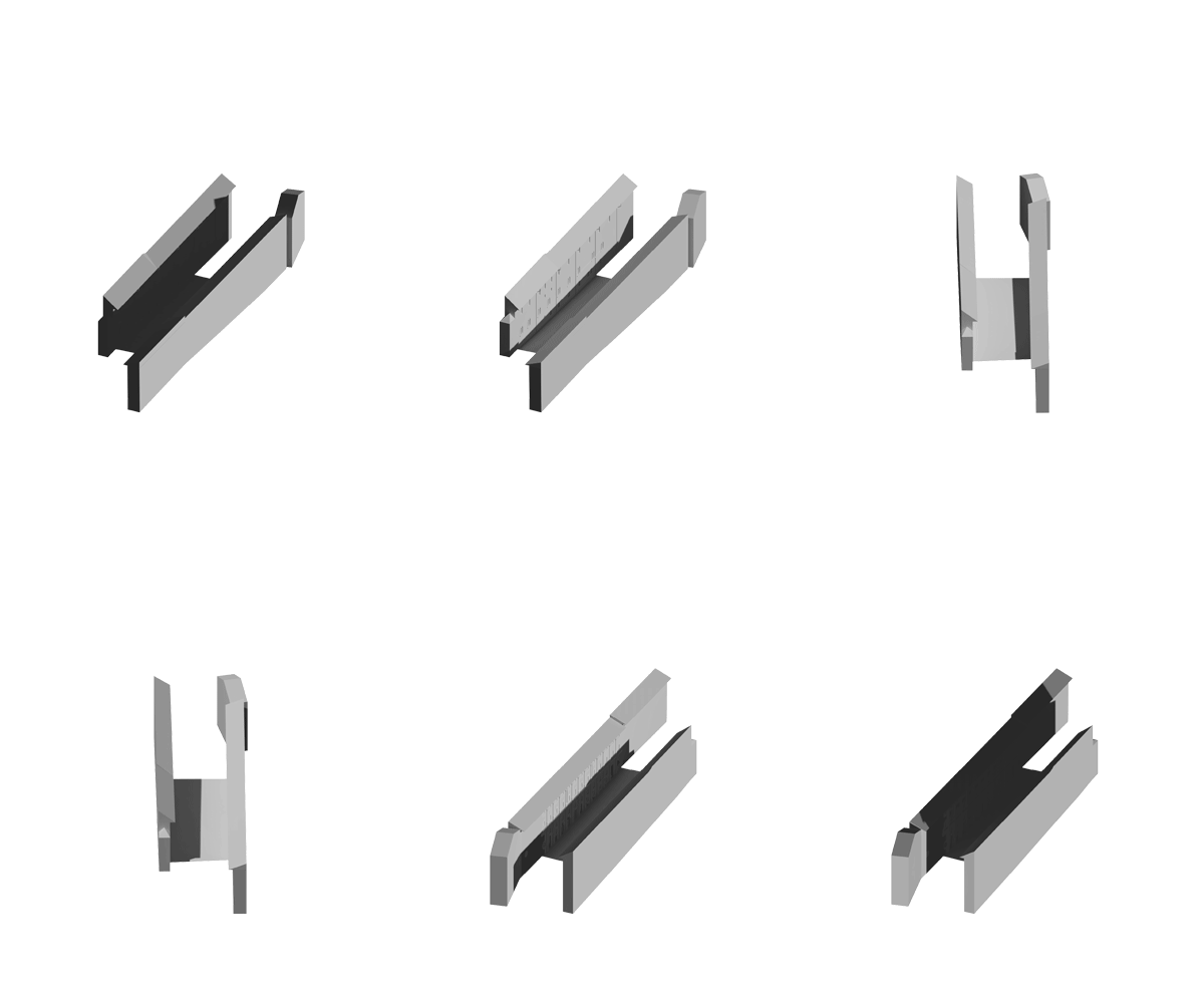
Exploring the possible views around an object. 3d modeling using vectorworks, color using photoshop.
Paper model
Exploded view
Side view
Project realized during the course of “Instruments for data visualization”, held by professor Marco Ferrari, ISIA Urbino, A.A. 2012/2013.
Visualize a day
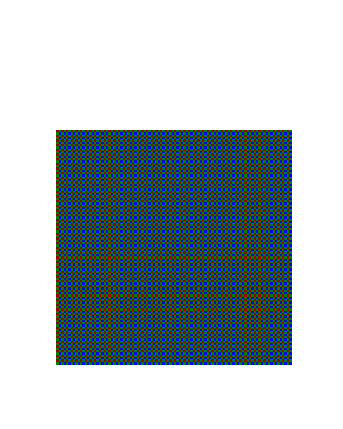
The pictures taken during a day, every 8 minutes, from the point of view of a person, are converted into sound thanks to MetaSynth. The data from the white balance and EV is instead used to create a variable bayer matrix that represents the color dominance and general luminosity that originally hit the camera sensor.
Project realized during the course of “Graphic design”, held by professor Marcello Signorile, ISIA Urbino, A.A. 2014/2015.
Interfaces and household appliances
'Thesis project'
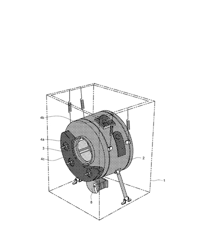
Interfaces and household appliances
Interaction with everyday machines
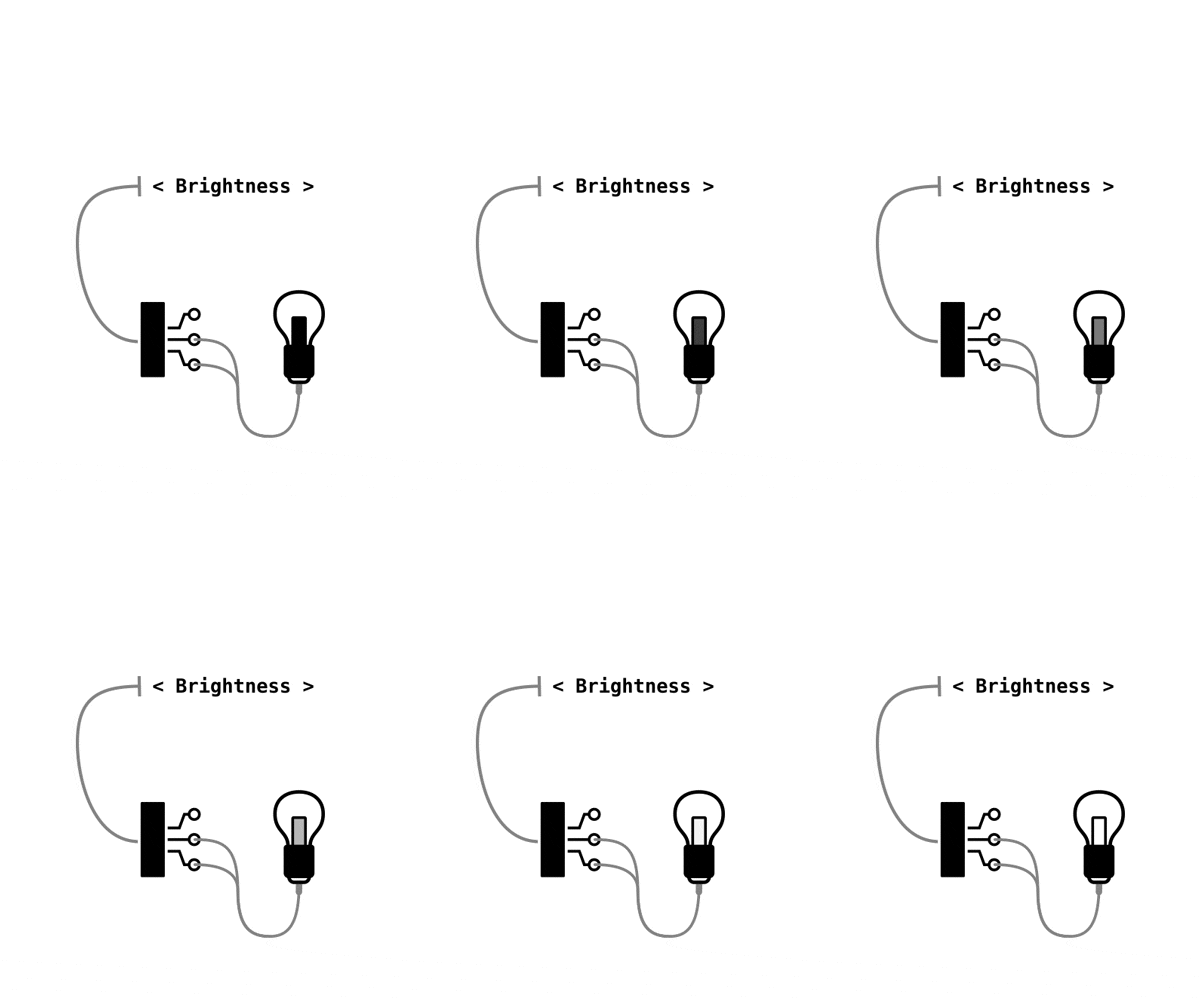
The project I embraced in the last part of my training at the ISIA in Urbino has led me to investigate what the human machine interaction is made of. The core of this research has been washing machines and laundry in general.
The washer is one of the most complex “utility appliances” we have deal with on a daily basis, therefor a perfect starting point for an analysis that got much deeper that the limited extent related to washing machine.
As a final experiment, an interactive prototype has been developed in order gain first hand experience and evaluate a few technical solution identified during the analysis. The last of many revisions can be tried here.
The entire publication is available on-line, on Issuu, in english,
pretty neat, right?
Thesis project presented on the 31st of March 2016, supervisor Luciano Perondi, co-supervisor Valentina Rachiele, ISIA Urbino, link to the discussion(in Italian).
21-23

The 21 - 23 project aims to metaphorically reconstruct the experience of running, with special attention to three basic elements:
- - Visual impediment consequence of constant motion.
- - Fragmented attention span.
- - Rhythmics of heartbeats and footsteps.
The raw images were shot by me, running, holding a digital camera equipped with a self-made pinhole lens. The experiment was divided in two running sessions around the small city of Pianoro, the first -21- picturing on to the industrial area of “Pian di Macina”, while the second -23- was shot in the residential and rural area. All the images have timestamps, later cross-referenced with a gps position registered using a smart phone.
The two videos have been produced using Processing for image sequencing and MetaSynth for sound design, visualization and geolocalization have been realized using NodeBox 1 (python).
Project realized during the course of “Photography”, held by professor Luca Capuano, ISIA Urbino, A.A. 2014/2015.
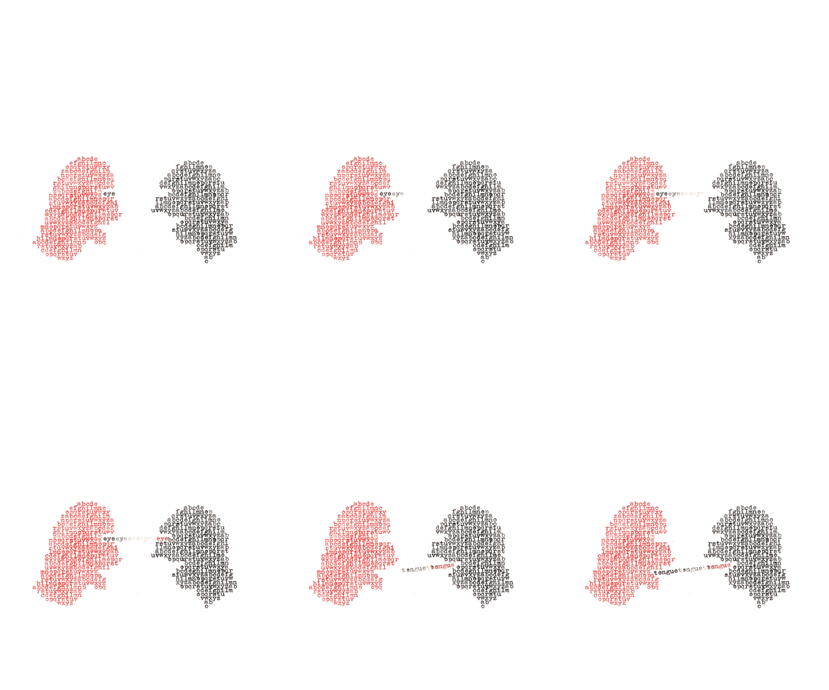
Pallinator
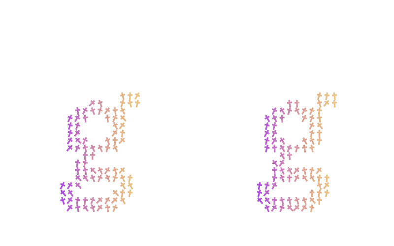
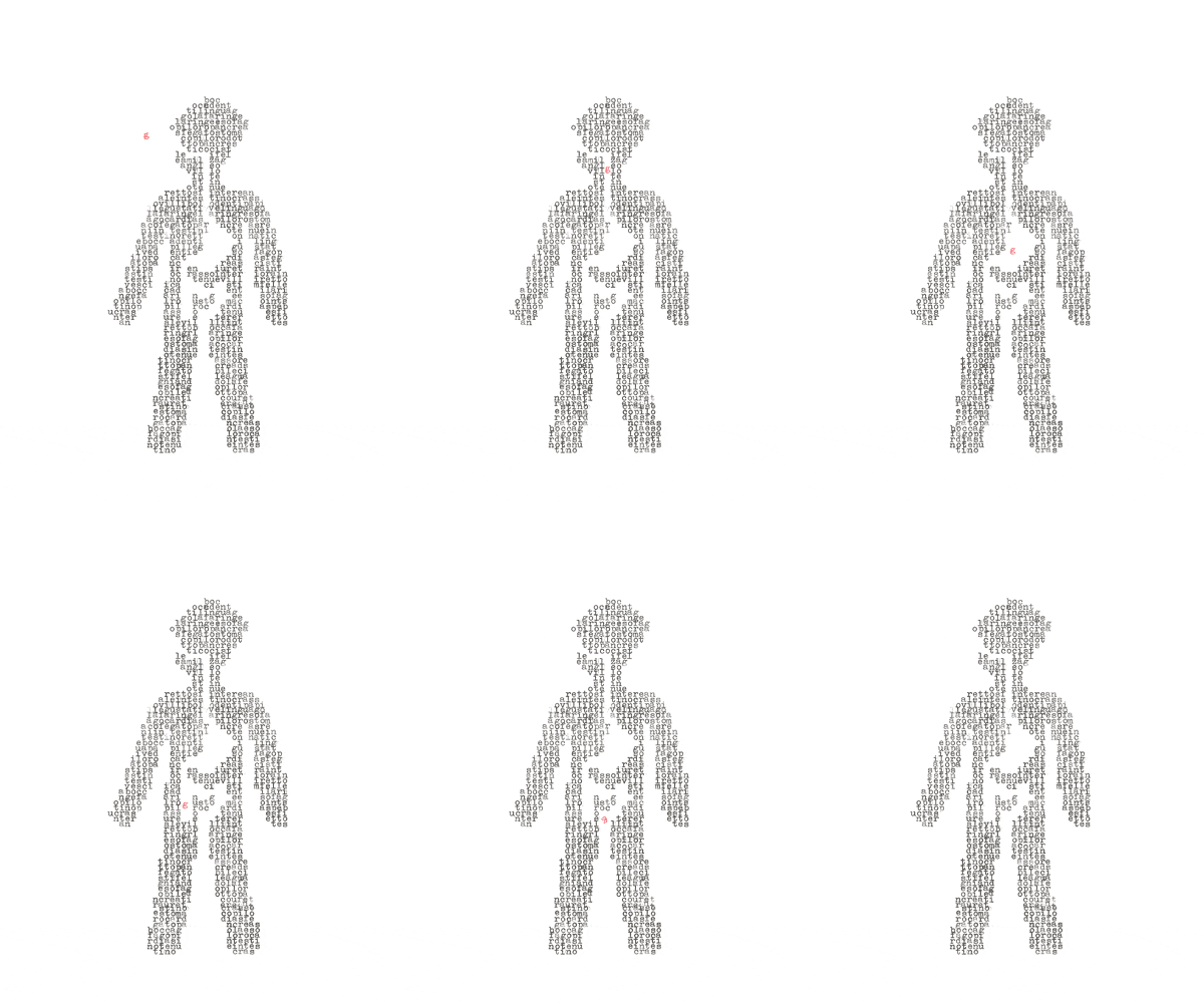
Pallinator is a small project, a simple python script that redraws a font using a grid of shapes. It can be adapted to do many thing, including recursive typography.
Personal project - 2015
Cognitive workload & Pupillometry
'Master project'
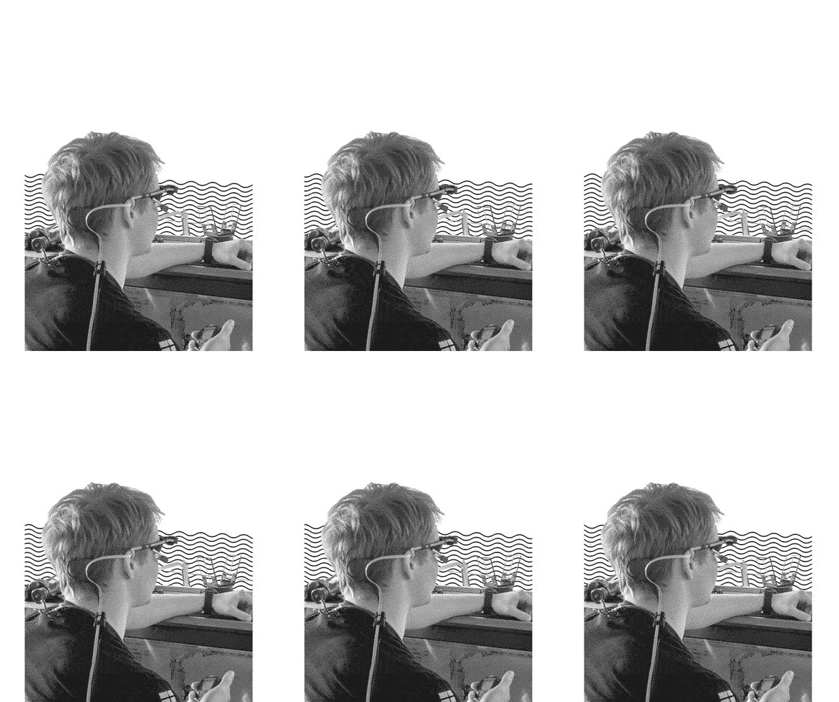
Development of a quantitative evaluation tool of cognitive workload in field studies through eye-tracking (Master Thesis and further journal publications). Development of a method for the measure- ment of cognitive workload in field conditions (eye-tracking and pupillometry). Eye-tracking data has been used alongside the video feed of the field of view of the operator/observer and the data from an external luminance sensor to quan- tify the luminous flux from the point of view of the subject and estimate the effect of a generic visual stimulus on the expected pupil size. The estimated pupil size is then used as a variat- ing baseline to remove the effect of luminance on the pupil size and isolate the changes relative to mental workload. This method has been validat- ed in the lab and then trailed in field conditions thanks to the collaboration of the Royal Norwe- gian Naval Academy. My main contribution has been developing the underling computer vision pipeline and adapting an off the shelve eye track- er to be able to record data on the visual stimuli. I also had experience in instrumenting and setting up eye tracking in the lab as well as in a mobile environment (Training Vessel provided by the Norwegian Navy).
Tool's Interface
Relative publications:
- Pignoni, Giovanni; Komandur, Sashidharan; Volden, Frode. (2020) Accounting for effects of variation in luminance in pupillometry for field measurements of cognitive workload. IEEE Sensors Journal.
- Streilein, Tim; Komandur, Sashidharan; Pignoni, Giovanni; Volden, Frode; Lunde, Petter; Mjelde, Frode Voll. (2020) Maritime Navigation: Characterizing Collaboration in a High-Speed Craft Navigation Activity. Commu- nications in Computer and Information Science. Vol. 1224.
- Pignoni, Giovanni; Hareide, Odd Sveinung; Komandur, Sashidharan; Volden, Frode. (2019) Trial application of pupillometry for a maritime usability study in field conditions. Necesse. Vol. 4.
- Pignoni, Giovanni; Komandur, Sashidharan. (2019) Development of a Quantitative Evaluation Tool of Cognitive Workload in Field Studies Through Eye Tracking. Lecture Notes in Computer Science. Vol. 11571.
Braccio-mecc
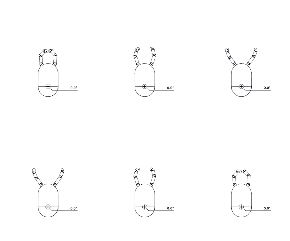
"braccio-mecc" is degenerated exercise started from the basic assignment to experiment with matrix. Try in your browser, the new p5.js version here.
Project realized during the course of “Mathematic for design”, held by professor Igino Marini, ISIA Urbino, A.A. 2012/2013.
Savanna
The Savanna is a spin off / regularization of an early version of the Savana that is being developed by Riccardo Govoni.
This is an ongoing project but the development is temporary on hold.
If you are interested in this project, would like to use it as it is, continue the development yourself or even get me to finish it just for you, drop me a mail.
cozy lummox gives smart squid who asks for job pen the lazy major was fixing cupids broken quiver sympathizing would fix quaker afta objectives a quick brown fox jumps over the lazy dog offagna quirky spud boys can jam after zapping five worthy polysixes the job of waxing linoleum frequently peeves chintzy kids sixty zips were quickly picked oflaga disco pax from the woven jute bag just poets wax boldly as kings and queens march over fuzz fiordo
cozy lummox gives smart squid who asks for job pen the lazy major was fixing cupids broken quiver sympathizing would fix quaker afta bjectives a quick brown fox jumps over the lazy dog offagna quirky spud boys can jam after zapping five worthy polysixes the job of waxing linoleum frequently peeves chintzy kids sixty zips were quickly picked oflaga disco pax from the woven jute bag just poets wax boldly as kings and queens march over fuzz fiordo
Toe-Tuch
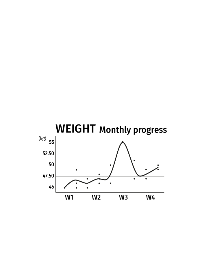

A more accessible Bathroom Scale “Toe-Tuch” (part of the Methods in User-Centered Design course held by professor Sashidharan Komandur). A prototype of a touch screen bathroom scale has been developed based on the evaluation of exist- ing bathroom scales on the market. The scope of the prototype has been to compare the two pos- sible interactions scenarios: touch screen mount- ed on the machine, operated with the foot (to achieve levels of functionalities of a smart scale usually only available through a smartphone), and touch screen mounted at eye level on a wall, to respond to the needs of users with low mobil- ity and deteriorating eyesight. The wooden prototype is a fully functional bathroom scale, weigh sensors and the touch screen are used to react to the various user inputs.
The prototype
Made in collaboration with Sabina Niewiadomska, Lam Kim Khoi and Mai Thao Nguyen..
Paratype "slab"
Parametric typography is a course about analysis of the relations between the typographic shapes of the letters.
The analysis is then translated in mathematical models that can reproduce different part of a fonts parametrically using RoboFont and the powerful RoboFab library.
A lot of fonts.
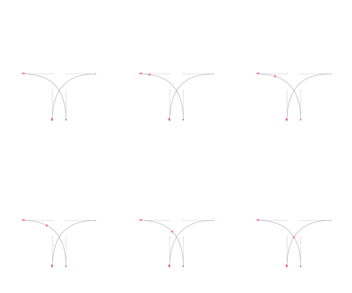
My work group focused on the behavior of slab serifs and the various optical correction that are applied when a sans is turned in to a serif. I developed a crude but effective way of finding the intersection between a bézier curve and a line or another bézier, this permitted us to cut raw shapes with high precision.
Were the bézier intersection has been used
Project realized during the course of “Parametric typography”, held by professor Luciano Perondi, ISIA Urbino, A.A. 2013/2014.
Riccardo Govoni, Bianca Maldini, Giovanni Pignoni.
Marche
The Marche typeface has been developed as part of a corporate image exercise regarding the identity of the homonym Italian region and is in fact inspired by the unique shapes of the marchisan hills.
The typeface was actively used in the logotype and applied on tourism advertisement and merchandise.
Different design stages
This is an ongoing project, still developed now and then.
If you are interested in this project, would like to use it as it is, continue the development yourself or even get me to finish it, drop me a mail.
Applications
Font developed during the course of “Corporate image”, held by professor Danny Kreeft, ISIA Urbino, A.A. 2014/2015.
AKG Packaging
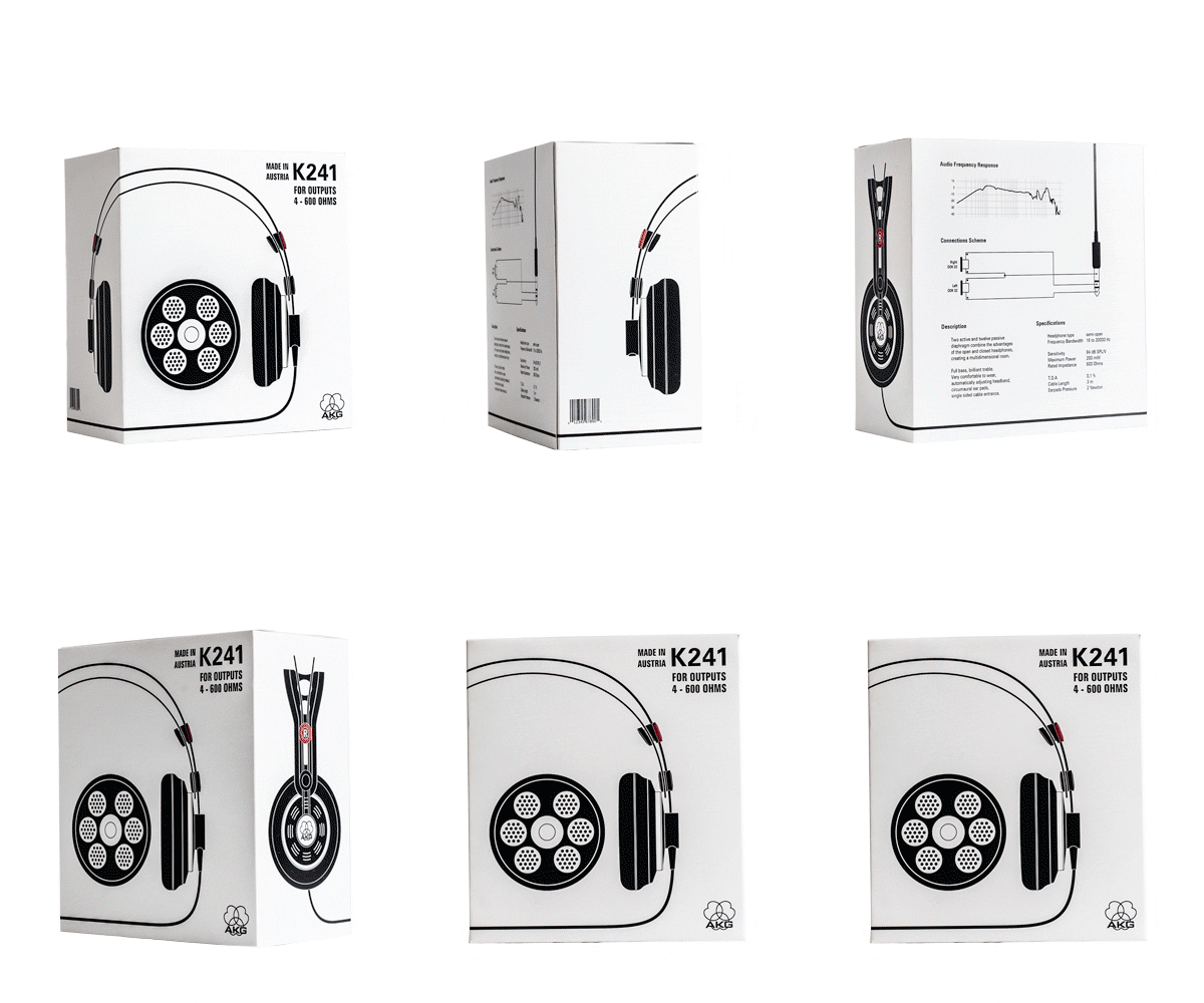
As consequence of my deep passion for headphones I redesigned the packaging for the vintage AKG K241 stereo headphones (very similar to the still in production K240 Studio).
The packaging includes a fully functional paper headphone stand, cheaper to produce than the wood made ones and more appropriate for a mid-class / mid-priced model like the K241.
The K 241 was the first headphone to use semipermeable material (an acoustically selected paper membrane) to fine tune the frequency response and is there for a milestone in acoustic design.
Project realized during the course of “Packaging”, held by professor Francesco Tacconi, ISIA Urbino, A.A. 2013/2014.
francescobertele

Website and online portfolio for Francesco Bertelé, a visual artist who traces his research path between exploration and experience. The website includes a serchable archive and portfolio with pdf export.
The interface
This website has been developed and launched in 2021 in collaboration with Simone Ellero (design).
My contribution has been the actual development of a custom Wordpress theme and the general responsive behaviour of the website. The website is visible here.
